UniGroup
Keeping freight costs in check when a vendor change broke automation
A vendor switch turned an automated freight decision into a manual one. I had two weeks to design a flow that kept planners choosing the lowest-cost carrier. They did 99% of the time, saving $100K.
- Role
- Product Designer
- Team
- Embedded designer on a product team with a product owner and 5–7 engineers
The short version
A change in logistics vendors removed an automated step. Choosing a carrier for less-than-truckload (LTL) shipments became a manual decision made by people, and every manual decision is a chance to overspend or miss a pickup.
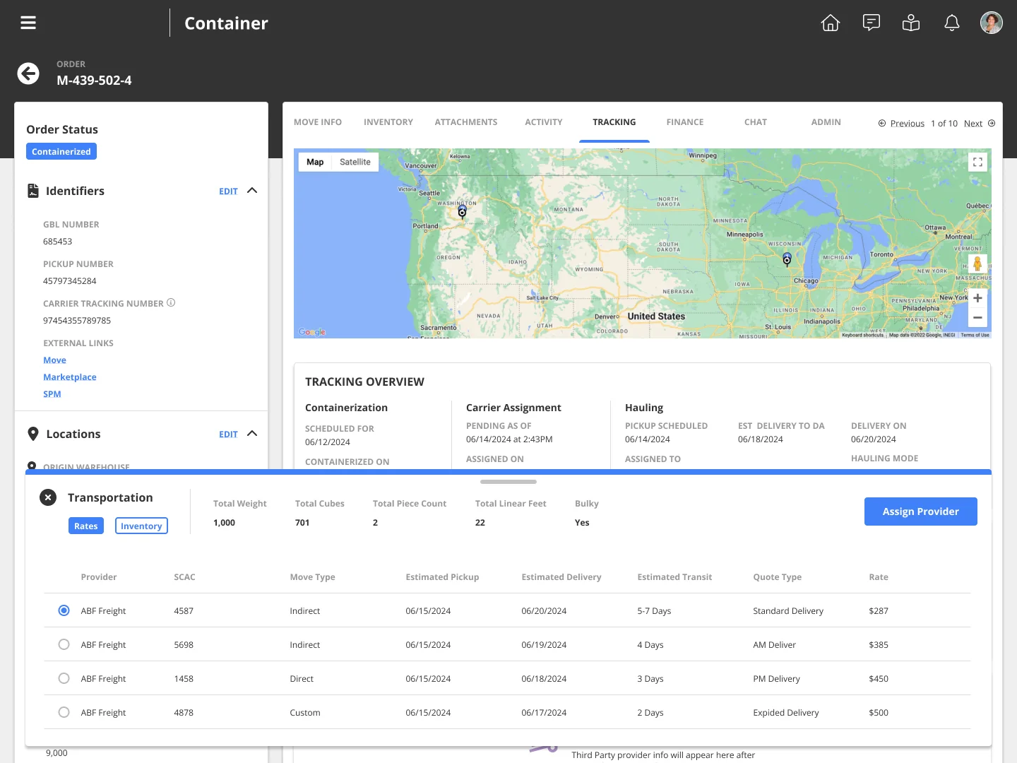
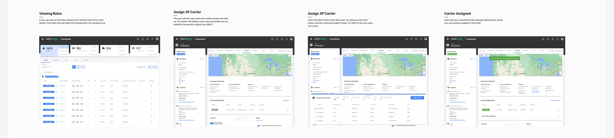
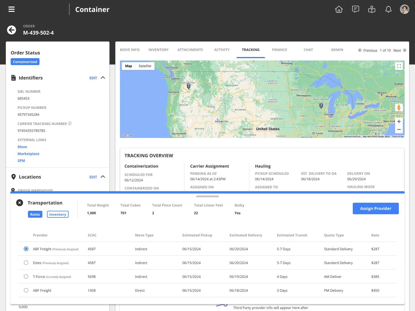
I had about two weeks. I designed carrier assignment directly into the order: rates appear inline, the cheapest option sorts to the top, and the order, map, and shipment contents stay in view. Planners chose the lowest-cost carrier 99% of the time, saving the company $100K.
The business problem
- Cost exposure. Without automation, carrier choice depended on each planner's judgment, so freight spend could drift order by order.
- Operational risk. The new vendor's process sent planners across several screens to compare and assign carriers, which put pickup windows at risk.
- A hard deadline. The vendor switch had a fixed date, so the workflow had to be ready when it happened.
My approach
I already knew the old automated flow well, so I skipped a full discovery cycle. I spent the time on targeted 30–45 minute sessions with planners and dispatchers to answer the questions that would decide the design:
- Where does the manual step happen in the order's lifecycle?
- What information does someone need to make the call confidently?
- What would make them leave the page, and how do we stop that?
Because the timeline was tight, I went straight to high-fidelity designs. Realistic screens got stakeholders aligned fast and gave users something concrete to react to.
The big decision: where the feature lives
The obvious home was the marketplace app, where carrier offers start and expire. I designed that version first, with open questions marked at every step.
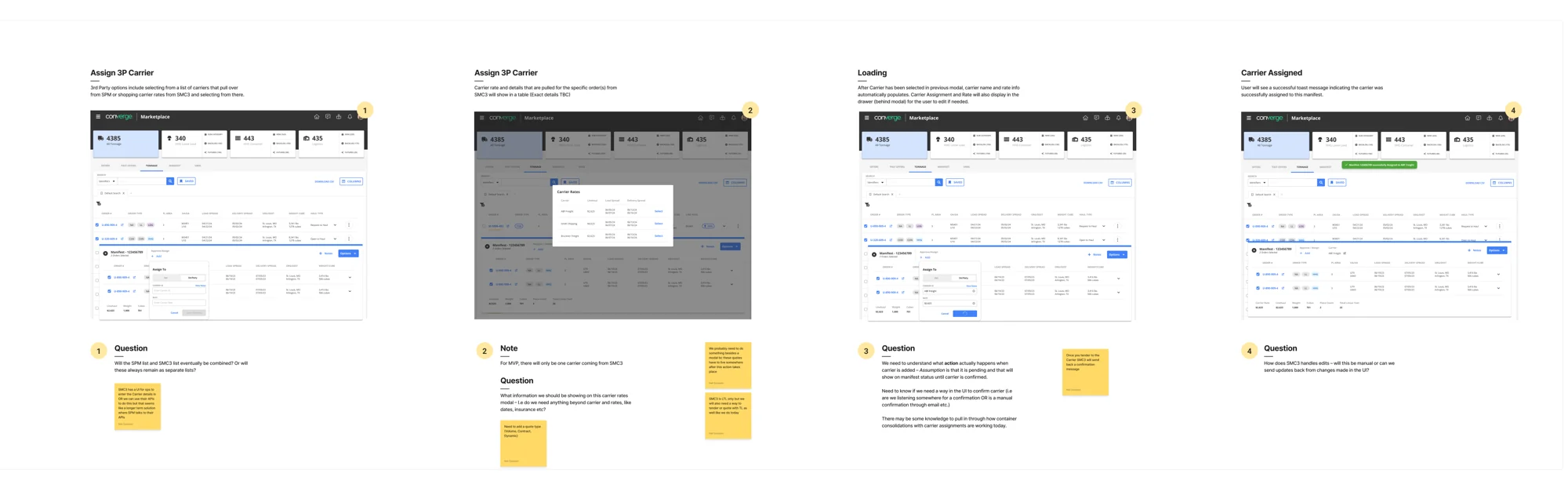
Walking planners through both options settled it: the work actually happens in the order-management app, next to the shipment and inventory data. Moving it there cost engineering extra work. I made the case that removing the context switch was worth it, and the team agreed.
Other decisions
- The default does the work. I sorted rates by lowest cost first. The cheapest option is the first thing a planner sees, and that default is the main reason the 99% figure held.
- One clear action. Users asked for a single-select list with one "Assign Provider" button: fewer chances to misclick and an obvious next step.
- Context without leaving the page. Early feedback showed planners kept leaving to check what was in the shipment. I added an Inventory tab next to Rates, which removed the most common reason to leave.
Outcome
- 99% of assignments went to the lowest-cost carrier, saving $100K in freight. Cost discipline held through the move from automated to manual.
- Ready for the vendor switch, designed and validated in about two weeks.
- Improved after launch, based on real usage:
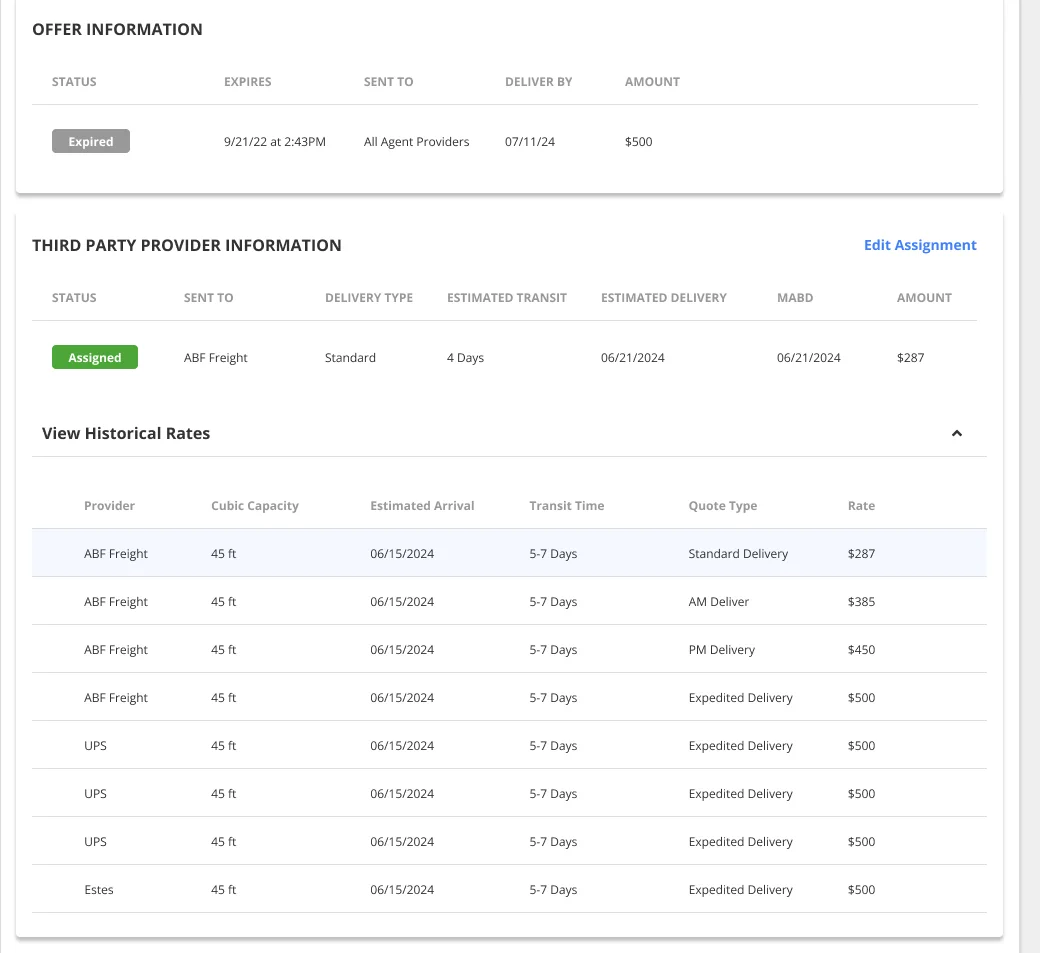
- Historical rates, so planners can sanity-check a quote against past prices for the same route.
- A previously-assigned-carrier check, to prevent costly reassignments after a carrier had already picked up.
What I learned
- Under a tight deadline, realistic screens beat abstract ones. High-fidelity designs turned open questions into decisions in days, not weeks.
- Defaults are strategy. Sorting cheapest-first did more for freight spend than any training would have.
- Test the obvious answer. The marketplace app looked like the right home. Putting both options in front of planners showed it wasn't.
- Measure what matters next. I'd track time from opening the panel to assigning, reassignment rate, and missed pickups, to show the results hold and catch it early if they slip.