UniGroup
Moving the central operations team off the mainframe
Two of the central team's most time-sensitive workflows, policy exception approvals and order messages, still ran on mainframe terminals. I led design for both: one research effort, two redesigns, and a shared plan for measuring whether they protect revenue.
- Role
- Senior Product Designer
- Team
- Embedded designer on a product team with a product owner and 5–7 engineers
The short version
UniGroup's central operations team makes fast, high-stakes calls all day: approving partners' requests to break booking policy, and responding to order changes that need a decision within 40 minutes. Both ran on mainframe terminals. Nothing alerted people when work arrived, the rules lived somewhere else, and every expired request meant starting over.
I treated it as one program, not two features. One round of research with the people doing the work shaped two redesigns: exception approvals and order messages. Both just launched, and I set up the measurement to tell us whether they're protecting revenue, not just whether people use them.

The business problem
- Slow decisions cost orders. Exception requests and action messages are time-sensitive. A late answer can delay a shipment or send the order elsewhere.
- No alarm. Nothing told people a request or message had arrived, so meeting deadlines meant checking terminals by hand, over and over.
- Decisions without context. The policy rules and the order's history lived on other screens, so outcomes depended on what each person remembered.
- Wasted work. An expired approval meant a brand-new request. A message said something changed, but not what it used to be.
- Migration risk. Both workflows had to keep every business rule while moving to the new platform.
One research effort, two workflows
I traced each workflow end to end with the people who do it, marked every point where they left the system or repeated work, and grouped what I heard into six themes: notifications and alerts, messages that need action, order status and ownership, manual tracking and follow-up, exception requests, and missing order details.
Three findings shaped both redesigns:
- "The system doesn't tell me when work needs attention." People checked multiple places by hand because nothing alerted them.
- Separate decisions from noise. Action-required items were buried among FYI updates.
- Context at the moment of the decision. People needed the rules and the order details where they decide, not three screens away.

Workflow 1: Order messages
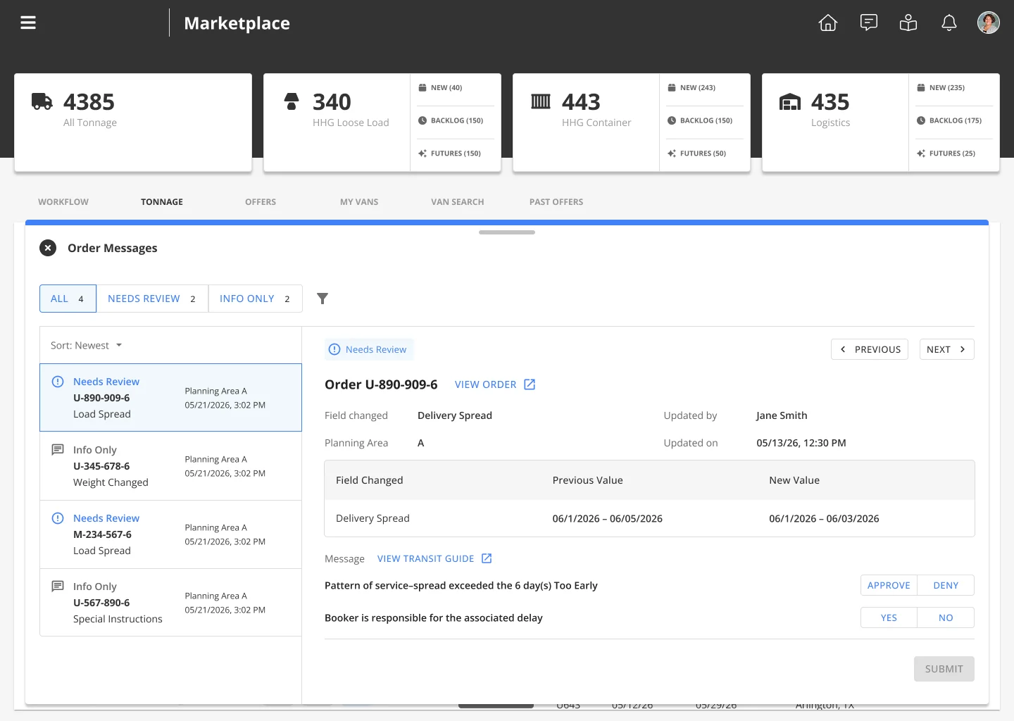
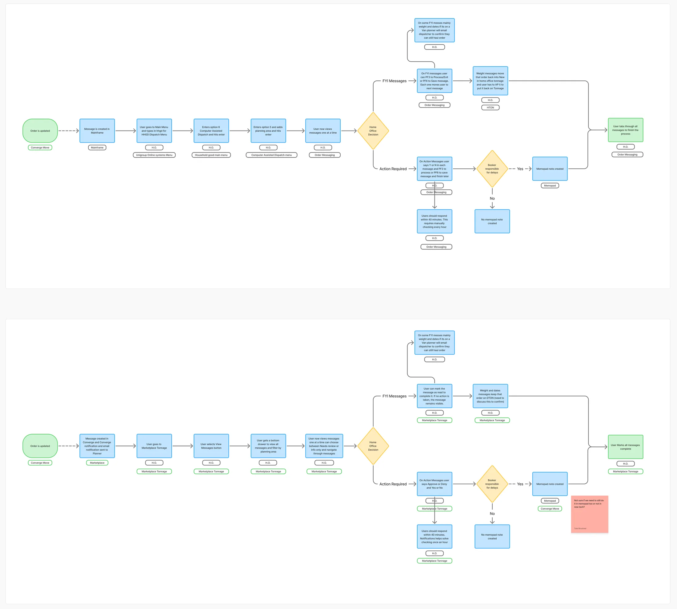
When an order changes, such as a new weight, a shifted date, or a delivery spread that breaks policy, a planner gets a message. Some are FYI. Others need a decision within 40 minutes. In the legacy system, planners navigated several menus and paged through messages one at a time.
- Tell people, don't make them look. Messages trigger a notification, so the 40-minute window no longer depends on remembering to check.
- One entry point where planners already work. A "View Messages" button on the tonnage view opens a drawer, so planners never lose their place in the queue.
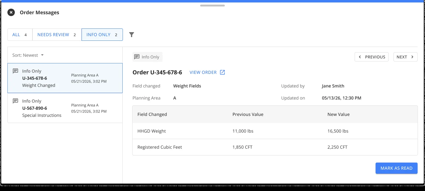
- Needs Review vs Info Only. Two tabs split decisions from updates.
- Show what changed. Every message shows the previous and new value, which ends the trip to the audit trail.
- Decision and accountability in one step. Approve or deny, and mark whether the booker is responsible for the delay.
Workflow 2: Exception approvals
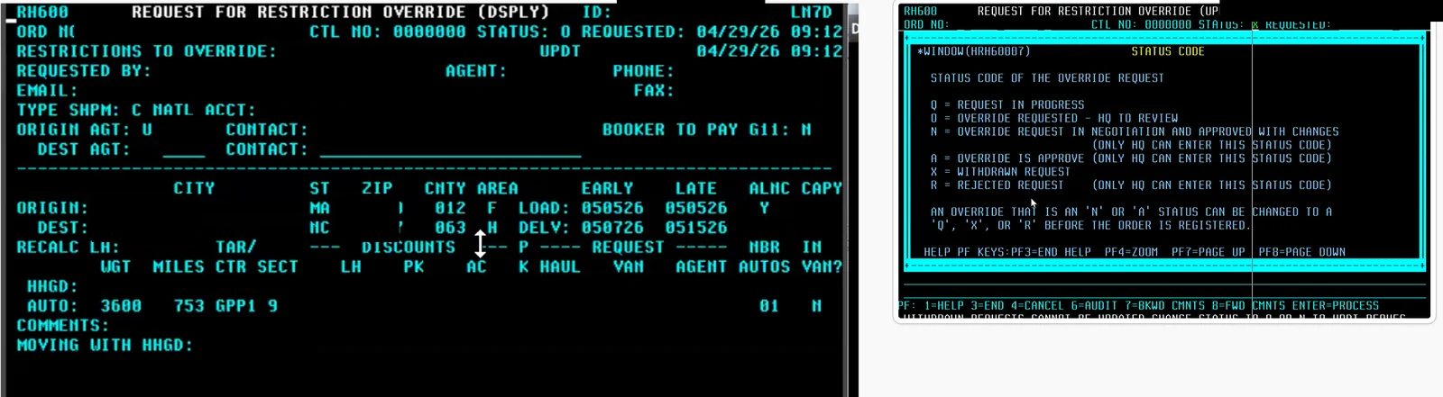
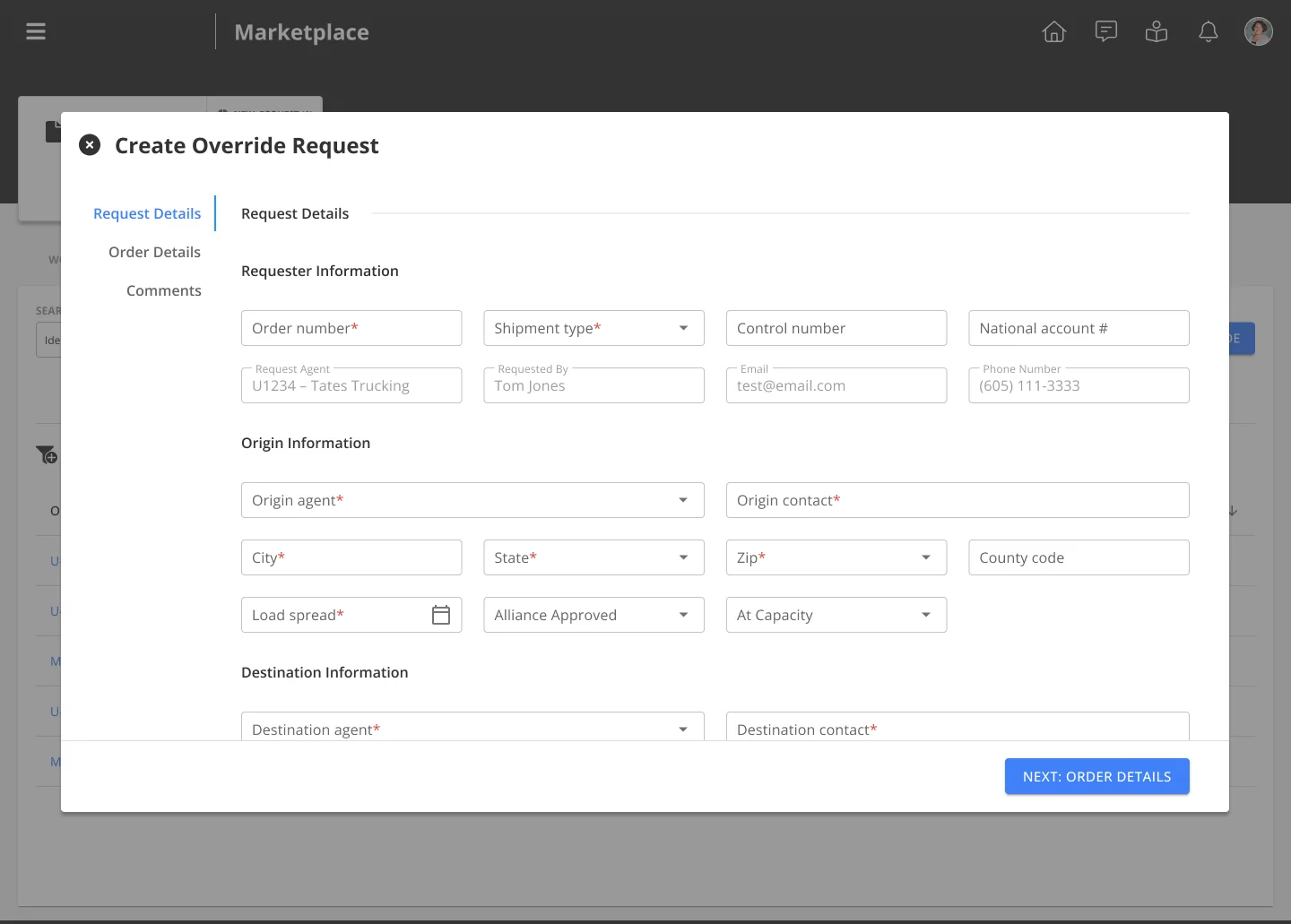
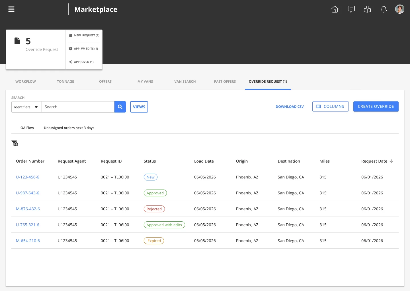
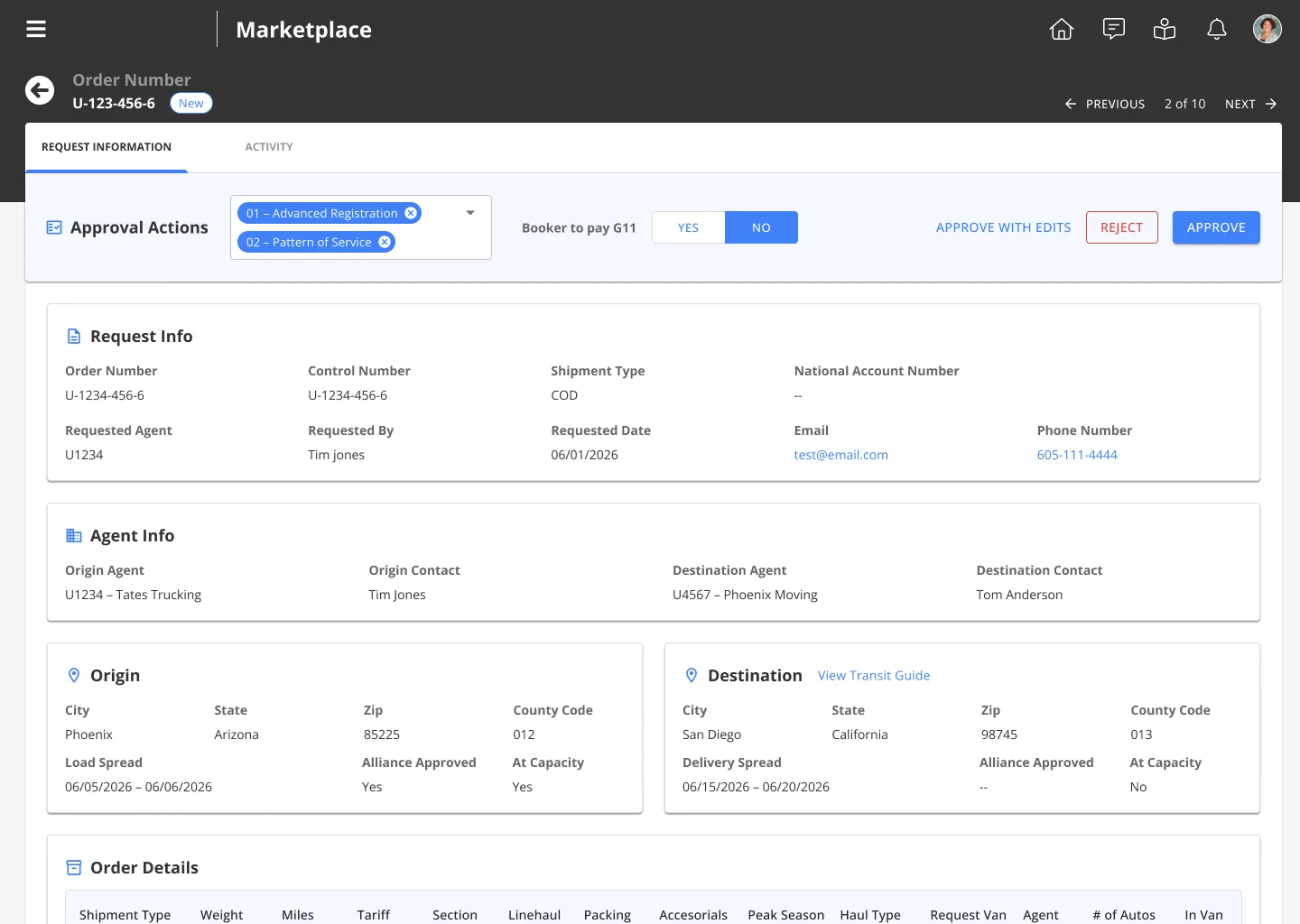
When a shipment breaks booking policy, a partner company requests an exception and the central team approves or rejects it, often against a deadline. The real problem wasn't the old interface. It was two connected workflows, requesting and deciding, with nothing shared between them, so I redesigned both sides together.
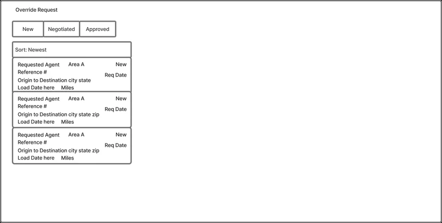
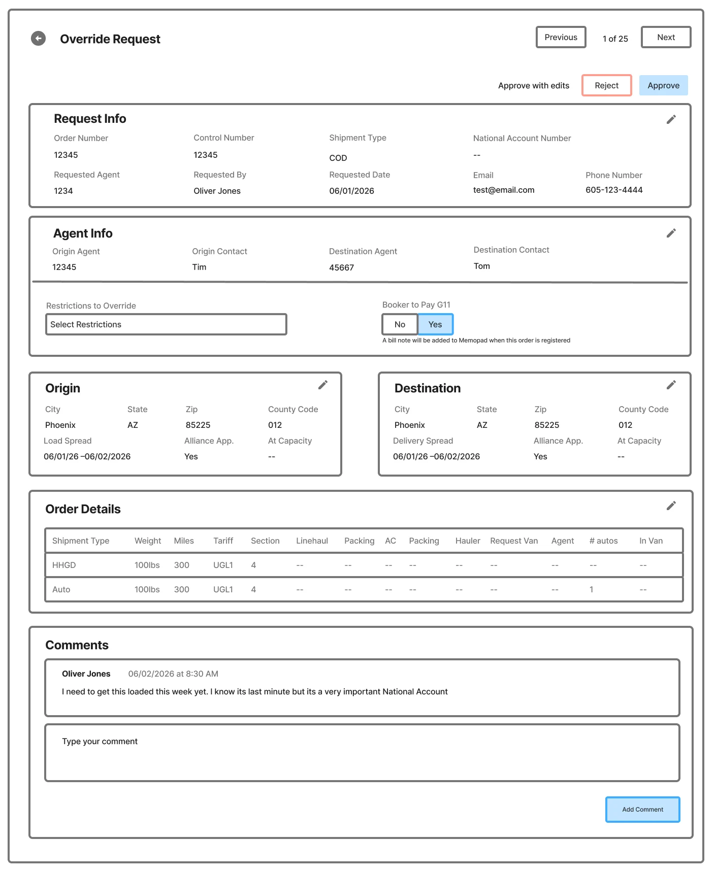
- Consistency doesn't mean reusing the same pattern. I started from the messages drawer for familiarity. Wireframes showed a decision this complex needs room for order data, rules, comments, and several outcomes, so I moved to a full-page review that keeps the familiar conventions.
- Split view vs full page. A list-plus-detail split made switching easy but squeezed the information people need. A full page with previous and next gives room and speed.
- Bring the rules to the decision. The policy guide is linked right from the request.
- Decision actions always visible. Approve, approve with edits, and reject stay pinned at the top.
- Reapproval instead of re-submission. An expired approval can be reapproved from the original request.
How we're measuring success
Both just launched, so it's too early for results. I set up the measurement before launch. The bet: alerting people and putting context next to the decision means more requests and messages get answered in time, so fewer orders are lost.
- Revenue protected: orders lost or delayed because a decision or response came too late.
- Response time: the share of action messages answered within 40 minutes, and the share of exception requests decided before the load date.
- Back-and-forth: emails and phone calls between partners, planners, and dispatchers to confirm changes.
- Notifications: how many planners keep alerts on. If people turn them off, the alerts aren't earning their place.
Adoption isn't on the list on purpose. Everyone is moving to the new platform, so usage is guaranteed. The real question is whether the tools make the team faster and protect revenue.
What I learned
- Run research at the program level. One study shaped two projects and kept them consistent, instead of two teams asking users the same questions.
- Some problems aren't screens, they're alarms. The biggest improvement in messages isn't a layout. It's that the system finally tells people when it needs them.
- Familiar isn't always right. Reusing my own drawer for approvals would have been consistent, and worse for the people using it.
- Define success before launch, and pick metrics that mean something. A mandatory migration makes adoption meaningless; revenue and response time aren't.